Google Chrome keeps getting uglier
I hate to say this, but the Google Chrome team keeps making poor design decisions to make it more and more ugly. I still remember the sad day when the kind of cool wrench button gave way to the utterly boring hamburger one. I also remember the sad day when the omnibox dropdown pointlessly went full width (after more than two years, I still fail to see how it makes any sense, although my eyes have long grown used to it).1 And I'm sure there are other stupid changes that I can't name at the moment.
Unfortunately, they just won't stop. Four days ago stable 49.0.2623.75 came out with a flurry of horrible visual changes.
The icon. For whatever reason I have the impression that I might have seen this a while ago, but let's just pretend it's brand new. The new app icon is the most outrageously flat icon I've even seen. Compare it to that of 48.0.2564.1032:

Old and new app icons side by side. To the left, the 48.0.2564.103 icon; to the right, the 49.0.2623.75 icon.
And let's see them in action:
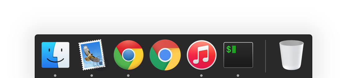
Both icons in the dock, old one the left and new one on the right.
Apart from flatness (lack of any gloss found in almost all Apple icons, however flattened they are), see how the new icon is notably larger than the old one, and any other circular icons for that matter. Apparently, consistency and guidelines mean nothing to them.
I wonder why they made this change. Maybe for material design? I certainly don't want to see my Mac infested by material design, thank you. And maybe to keep the icon in line with their new Google branding? Indeed, just like the new Google logo which did away with serifs, this one has no depth at all and is very childish.
It's a shame I can't just throw this icon out of my dock. Looks like in addition to iTunes now I have yet another icon to replace following each update, except this one updates much more often, and almost silently.
Downloads. I almost thought I was hacked when I opened the Downloads tab and saw
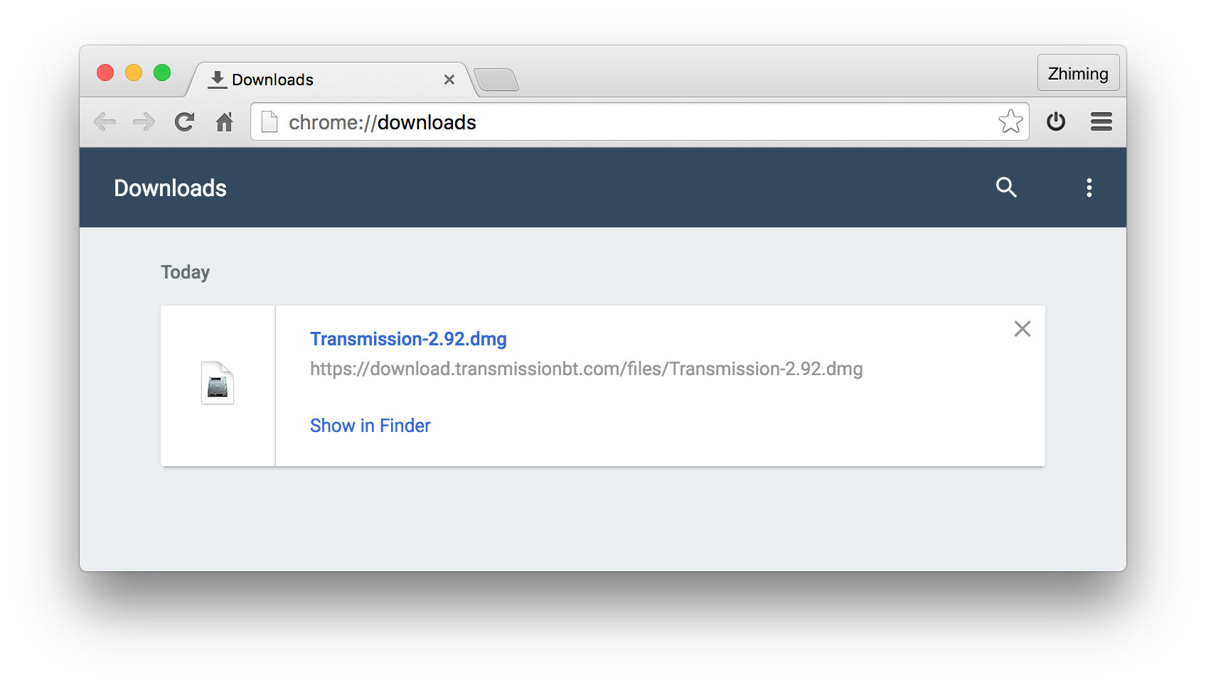
Downloads in 49.0.2623.75.
instead of a nice and clean
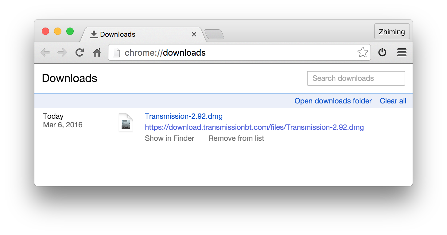
Downloads in 48.0.2564.103.
Materail design infestation, apparently. Funny how they managed to convey less info in a LOT more space, and look horrible at the same time. At least they can choose a pleasant color palette if they want to use color (which is totally unnecessary as seen from the old design)? No, they can't.
Incognito mode. There's a reason why books are printed on light-colored paper, and there's a reason why the web is predominantly light-backgrounded, including user agent default style sheets. The old incognito follows the light background rule, plus a non-intrusive notice in the middle and a reasonably shaded tab bar to indicate incognito status:
Incognito window in 48.0.2564.103.
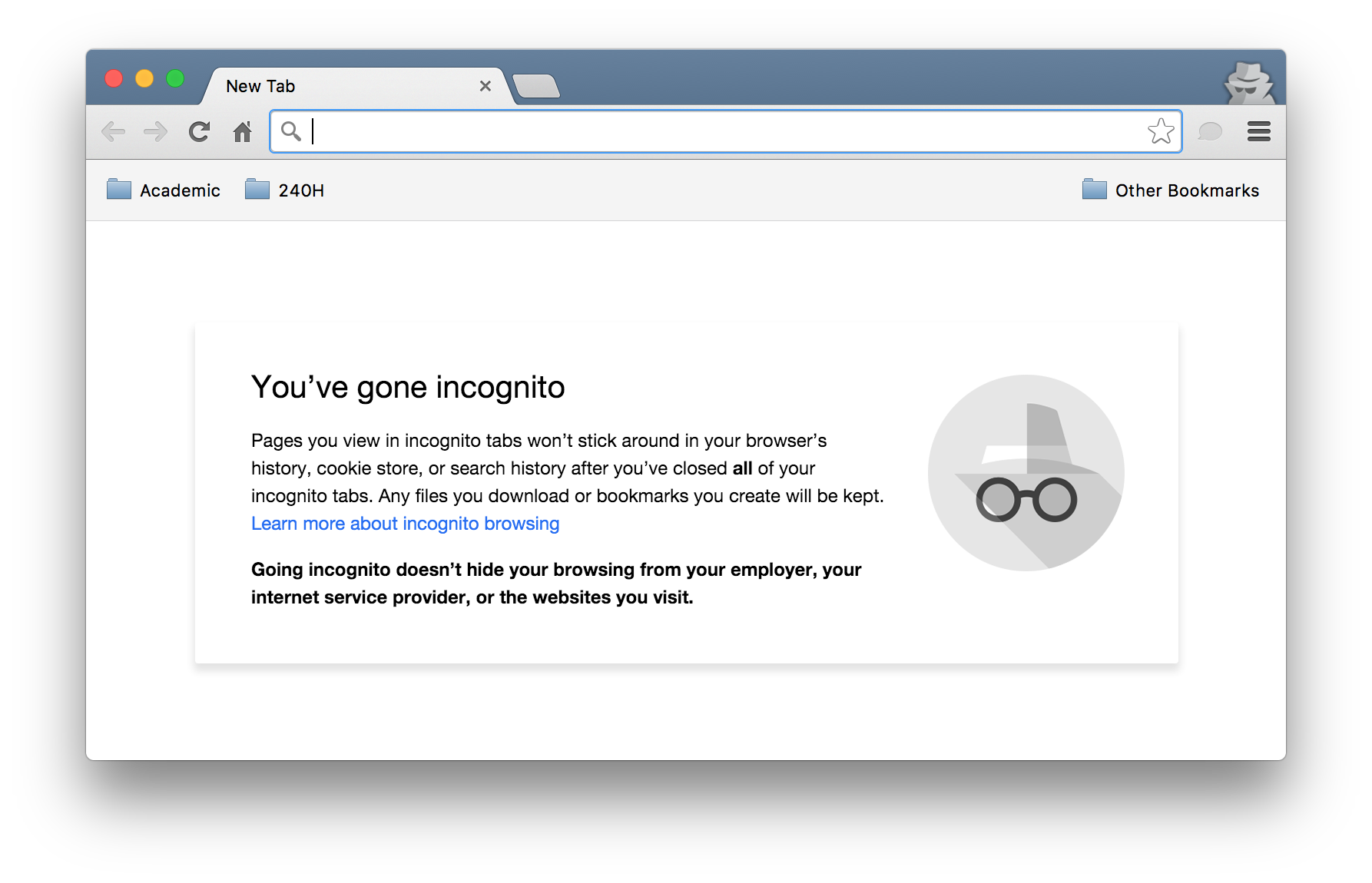
But not anymore. Since those of you using Incognito mode must be conducting shady business, why not highlight that with a black background:
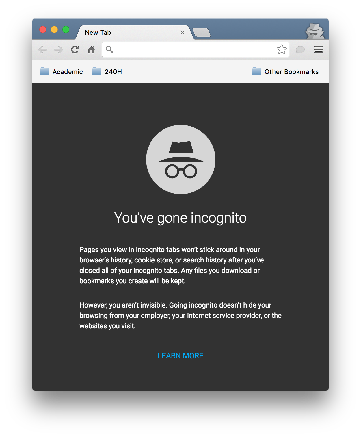
Incognito window in 49.0.2623.75. Even more shocking if you maximize your browser windows.
Oh. My. God. Now I hesitate whenever I want to press ⇧⌘N; it's just too great a cultural shock for me to handle.
Those are just three changes I've discovered so far. Hopefully there are no more lurking surprises.
Conclusion? Sigh.
03/09/2016 update. They also broke showing/hiding extension buttons (from toolbar) recently, probably in the same update. We used to be able to reshow a hidden button from chrome://extensions; that's no longer possible. Now we need to click on the hamburger (great), right click on one of the hidden buttons — which temporarily promotes the button to the toolbar and display the context menu, and while the context menu is still on, click on "Keep in Toolbar". So intuitive, your average computer users are definitely going to figure that out by themselves. Very nice.
Dev left a comment when marking that issue as wont fix:
... The current look is a precursor to a family of related work to make the Omnibox better, so expect to see more investment in this space to come. ...
A family of related work? After 2.5 years the omnibox looks almost exactly the same as the screenshot in the issue. More to come my ass. Maybe I should be grateful, at least it didn't get worse.↩︎
I realized the last stable was 48.0.2564.109 instead of 48.0.2564.103 only after taking the screenshots. Doesn't matter anyway.↩︎