Chrome disappointment: the shabby and boring old bookmark system from Stone Age strikes back
I just restarted my machine (in the process of planning a fresh OS re-install), and something in Chrome's UI immediately felt wrong. After a few moments I realized it was the star button (bookmark button) in the far right of the omnibox giving me the uneasy feeling — the old bookmark system is back. Broadcasting from stable channel, build 43.0.2357.124 on OS X.

What caught my immediate attention.
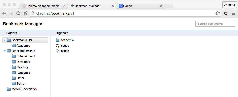
The heart sinking feeling when I saw this again.
I went to flags and made sure "Enable the new bookmark app system" wasn't tempered with. It wasn't. Anyway, I changed it to "Enabled" and restarted Chrome. No go, still the old crap. So I Googled my way to the announcement:
Hi Everyone,
Our team is committed to improving Chrome’s bookmarks experience, but for the time being, we’ve decided to bring back the previous version. Our team will continue to explore other ways to improve the bookmarks experience. You’ll see the previous version of the bookmarks manager return to your Chrome browser shortly.
For those of you who enjoyed using the new bookmarks manager, you can still keep the new experience by downloading the Bookmarks Manager extension from the Chrome Web Store.
We appreciate hearing all of your thoughtful feedback. Feel free to leave us with any additional comments here in this thread.
Best,
The Chrome team
This is just very disappointing. My default browser changes a lot, but I've been tagging along with Opera for almost the entirety of 2014, so I've long been used to visual bookmarks. And honestly, it never felt weird or anything; I saw it as an improvement the first time I was introduced to the concept.
I know, there's always a demographic that would fiercely resist any change; they would reject anything new at a glance (or after using for a second) and start moaning right away, disregarding all the new benefits here and there. There's also another demographic who not only have no taste in design at all, but would also actively seek to tear down any visual enhancement — 90s visual is enough for them for life, any more is unsolicited and insulting. When these two demographics meet1 and somehow make the developers retreat, the outcome is simple and sad: we can never have nice things.
I'm not saying I'm 100% satisfied with Chrome's visual bookmarks. In fact far from that. For one thing, Google is really pretty bad at visual design.2 Also, not being able to adjust tile size or toggle a list view is rather lame. However, whatever problems there are, the new system is at least 200% better than the old one (just look that the screenshots!).3 The team should focus on making the new system better, such as implementing the features I mentioned above, rather than throw it into the trash can and resurrect the old system from Stone Age.
I know, throwing things away is part of Google's philosophy. They usually toy with a wide range of ideas and discard the ones that people don't buy into. Not that I whole-heartedly agree with strategy, but to advance technology there has to be some Brownian motion out there, and Google usually listens to the market, which is fine. In this case, however, there's really nothing innovative about visual bookmarks, and I can't see how the new system could harm market share or anything either. In fact, it could only help, since except the anti-design demographic, who would choose the aged and boring layout from the old system?4 Moreover, people tend to ignore the fact that the new system is also functionally superior — it offers to
- Learn and suggest folder for a new bookmark (which is often accurate);
- Create auto folders based on site or keyword;
- Allow arbitrary text data to be stored with each entry (e.g., a page-specific non-sensitive access code);
- One tap pop from assigned folder;
and more. Those that resist everything new are simply blind. The team claim that they are listening to "thoughtful feedback"; well, can they tell "thoughtful feedback" from blind suspicion and denial about everything? And they do realize that feedback is heavily biased, as someone with positive experience (unless he is a hardcore fan) is unlikely to leave them a thank you message? I think it's pretty clear that the majority of users won't care either way5; the majority of the rest was happy with the change; and the rest, comprising only a diminishingly small percentage, is what kept us from having nice things.
Even if one agrees with nothing from the last paragraph, one has to realize that randomly dropping a big change this way is just irresponsible.6 There were hurt feelings when the change was first introduced (not that I care about them), so don't change mind again three weeks later, hurting yet another camp. Whether it was a change for the good or the bad, admit it was done (admit you screwed up if you did) and focus on improving it.
End of rant, off to install the Bookmark Manager extension.
There's actually a pretty big overlap between these two demographics.↩︎
The giant blue search bar at the top is especially ridiculous.↩︎
I didn't bother to switch to an earlier build just to take a screenshot of the visual system, so unfortunately there's no comparison here. But anyone who's been there knows what I'm saying.↩︎
Unless one has hundreds of bookmarks in a single folder (which probably means some cleanup or refactoring is long overdue), the old layout is unlikely to be easier on the eyes or anything.↩︎
Well, grandmas have one more thing to learn, I guess...↩︎
In other news, Google dropped YouTube collections two weeks ago (May 26, 2015), causing another round of agony. Also, subscriptions were all over the place once more, just like Google's project landscape.↩︎